This article will teach you everything you need to get started writing CSS for pages that are intended to be printed.
The @media rule
If you’ve done any responsive design, you’ll already know about the @media rule. As well as different screen sizes, @media also lets you target “print” media. Here’s an example:
Using this rule, you can specify your standard CSS as normal and then add some custom styles that will only be used when printing.
p { margin: 1em 0; }
@media print {
/* Hide related article links when printing. */
.related-articles { display: none; }
}
If you want to “zero out” all your standard screen styles and start from scratch, you can wrap your screen styles in another @media rule:
@media screen {
/* standard styles here. */
}
@media print {
/* print styles here. */
}
Page break properties
To make sure the content flows smoothly across pages, you’ll want to control when content gets split between pages. For example, it looks awkward if a large heading appears at the bottom of a page - you want it to start on a new page instead. Similarly, you may want to avoid a table spanning multiple pages if possible.
You can do this using page-break-before, page-break-after, and page-break-inside. You can set the value for these properties to always or avoid.
h1 {
/* h1 elements always start on the top of a new page. */
page-break-before: always;
}
section.city-map {
/* this section always occupies it's own page or pages. */
page-break-before: always;
page-break-after: always;
}
table {
/* tables don't split across pages if possible. */
page-break-inside: avoid;
}
Tip: Repeat table headings
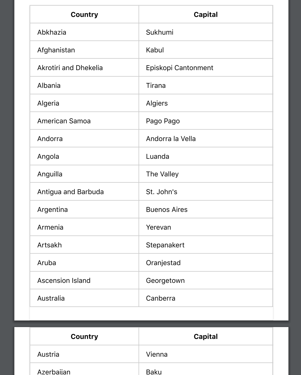
If your document has tables that span multiple pages, it’ll be hard to read when printed unless the table headers are repeated at the start of each page. This is pretty easy to accomplish - just use the thead and tbody elements in your table.
<table>
<thead>
<tr>
<th>City</th>
<th>Population</th>
</thead>
<tbody>
<tr>
<td>Sydney</td>
<td>4.627 million (2018)</td>
</tr>
</tbody>
</table>
When printed, your table will then look something like this:

Tip: Adding or removing content
Sometimes you might want to add content that’s only shown when printing. For example - you might want to link URLs to be printed. You can do this by using the :after pseudo-element:
@media print {
a[href]:after {
content: " (" attr(href) ")";
}
}
You might also want to hide or show certain elements only when printing. By combining @media and display this can be done quite easily.
/* hide the watermark on screens. */
.watermark {
display: none;
}
@media print {
/* hide the navidation when printing. */
nav {
display: hide;
}
/* show the watermark when printing */
.watermark {
display: initial;
}
}
Tip: Use emulate CSS media for development
To speed up your feedback loop during development, you can set your browser to display print styles. To do this in Chrome on Mac, open developer tools, then use the command-shift-P shortcut for “Run Command” and search for “Emulate CSS print media type”.

Other browsers will have a similar feature in their dev tools.
Unfortunately to see page breaks you’ll need to print to PDF manually each time.
Advanced tip: Orphans and widows
The orphans and widows properties control how text in an element is split across pages. Sometimes tweaking these values can improve the readability of your printed document.
p {
/* if there aren't at least three lines before the page
break, move the element to the start of a new page. */
orphans: 3;
}

On the left below, orphans is set to 2, so the second paragraph begins before the page break. By setting orphans to 3, as on the right, the paragraph is forced down to the start of the next page.
The widows property is the opposite of orphans - it specifies the minimum number of lines that can be at the start of a new page.
Advanced tip: the @page rule
With the @page rule, you can customise the page margin for specific pages.
@page:first {
/* No margin on the first page. */
margin: 0;
}
@page {
/* Set a margin on all other pages. */
margin: 2cm;
}
Unfortunately, browser support for this is currently a little limited and you can only use the :first, :last, :left, :right and :blank pseudo-selectors to select pages.
Summary
You’re now familiar with the important properties for print layout that are supported by modern browsers like Chrome, Firefox and Safari.
Unfortunately support for more advanced print layout features in modern browsers is generally limited. For example, browsers don’t provide a standard way of adding custom header or footer content using CSS. You may want to check out the paged.js project which offers a polyfill for many of the print layout features browsers are currently missing.
Finally, if you’re running a web app and looking to add PDF functionality, check out Paperplane - our easy to use HTML to PDF conversion API.

